Cardiff 2-1 Stoke City – Oh God, Everybody Panic

Well, it’s been a couple of months since my last written piece, so I guess I should check in on how Stoke are doing- oh. Wow. Erm. S***.

It really wasn’t fun watching Stoke’s latest attempt to shoot their own feet off in the Welsh capital, and it doesn’t help that it was a tale we’ve all read before.

A slow start, a couple of cheap goals gifted to the opposition, a second half with some huffing and puffing but no real end product, and yet another match where the manager is left bemoaning defensive frailties and poor finishing.

But why? What’s wrong with us? Why can’t we just be normal?

Here are a few of my main takeaways from the game which dropped Stoke into the bottom 3 for the first time since the first lockdown, in that long-forgotten summer of 2020.

Panic! In The Penalty Box

Starting off defensively, we’ve seen the return of a long-maligned aspect of Stoke’s past 6 years in the Championship over the past few weeks, as defensive frailties in small moments of the match inevitably lead to opposition goals.

Red areas indicate periods where Stoke generated more threat, and blue areas indicate periods where Cardiff generated more threat.

The first goal came from a set piece during a period of Cardiff dominance, and the second came after a similar period of Stoke dominance, and this defensive frailty has plagued the team consistently under several managers now.

From Steven Schumacher’s 12 league games so far, Stoke have conceded 18 goals in total. In 7 of these 12 games, they’ve conceded the first goal, coming back to gain just 1 point from those 7 matches in the away game vs Watford.

But strangely enough, Stoke are actually looking okay in some of their defensive underlying numbers. They’re well below the average in terms of the number of times they allow the opposition into their defensive 3rd, and similarly below the average in the number of times opponents get into their penalty area. Pretty good? Right?

Given that we’ve played Leicester, Ipswich, and Coventry in that time, that certainly looks okay at a glance. But as always, stats need context and depth, and some of you may already be shouting at the screen in anger.

“We Lost It In Those Small Moments” – Ancient Proverb, Unknown Stoke City Managers circa 2018-2024.

Whilst Stoke appear good at stopping opponents getting into the box and final third, when we look at a slightly different aspect of their defending, we see the issue.

The y axis denotes the average number of goals a team concedes from every 100 times the opponent gets into their penalty area. The x axis denotes the average number of times a team allows their opponent into their penalty area for each 100 times they allow an opponent into the final 3rd. The size of the circle denotes the amount of xG that team concedes.

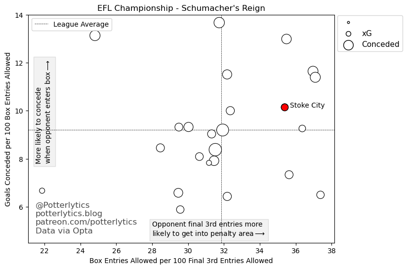
The plot above shows us, in my opinion, part of the reason Stoke are managing to concede so many in recent games. Two major things are noticeable.

Firstly, when an opponent gets into the final 3rd against Stoke, they’re much more likely than average to continue into the penalty area.

Secondly, once an opponent gets into Stoke’s penalty area, they are more likely than average to score a goal, despite Stoke conceding a relatively low xG (See my xG explainer here).

Part of this is explained by the fact Stoke often concede early, so opponents don’t need to push forwards as much or try to create chances, but it also showcases the frailty in the defence that means opponents are gifted those early goals.

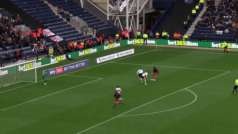
Let’s take a look at the second goal vs Cardiff as an example.

Talk about the fact we can’t recognise danger, despite a several second scrap no-one gets back and they’re 4v3.

Image: Wyscout

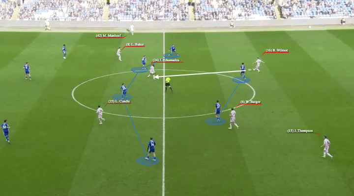
First up, this is a pretty standard piece of play. Tchamadeu has come into the number 6 role to receive the ball, and there is a line of 4 ahead of him in Bae, Cundle, Baker and Manhoef, with Ennis on the back line. This is a really good thing for Schumacher’s plan, Tchamadeu is free and there are Stoke players in between Cardiff’s pressing lines.

But then, disaster. Tchamadeu’s touch isn’t quite right, and he’s pressed well by Cardiff. He retreats and tries to play the bouncing ball back to a defender, but it never quite sits for him to play it cleanly.

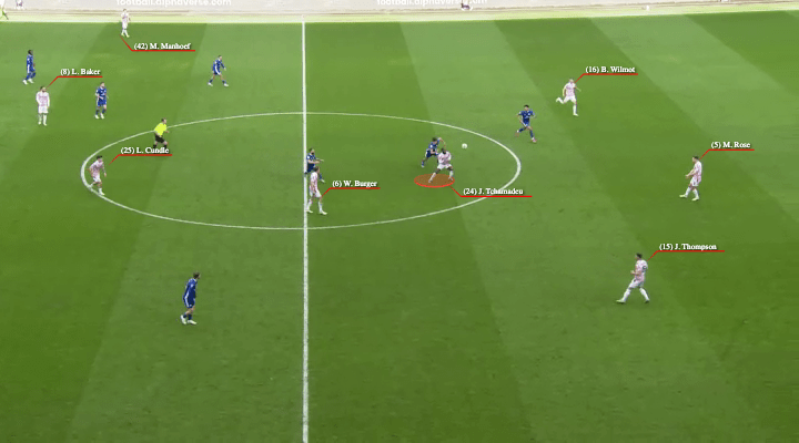
In the 7 seconds between the first and second images, a scrap is taking place. Burger comes in to help, and Cundle drops towards the melee. All the while, Bowler and Grant push forward for Cardiff, sensing that there may be a big chance here should the ball pop out in their favour. The midfielder closest to Baker moves up to become a passing option, and the ball gets to him.

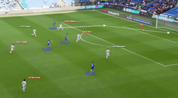
Within two unopposed straight passes of a 10-second 50/50 scrap around the centre circle, Cardiff are in on goal with a 4v3. Burger, Cundle and Bae are dropping to help, but realistically only Wilmot, Rose and Thompson are in position to stop the attack unless Grant slows the play down.

Wilmot shepherds Grant well down the wide area, and forces a left footed shot, but still at this point he has the option of shooting, playing across goal, or pulling back to the Cardiff player on the edge of the box.

From image 1 to a goal within 3 passes. 10 seconds of play where Stoke’s midfield were watching and waiting, rather than dropping behind the ball ready to help the defence.

I’m being slightly harsh there, as you wouldn’t expect everyone to immediately drop behind the ball, and the shot will disappoint Iversen, who is currently underperforming his Post-Shot xG numbers by a goal every other game, but this is a goal that is inherently Stoke-like.

Midfielders slow to recognise the danger, recovering slowly both in behind the ball when it’s in the 50/50, and even slower when the ball is going towards the box, and a shot from a low-value position against a set goalkeeper still somehow finding its way into the goal.

Specifically looking at the slow recovery of midfielders, my instinct is to consider the fluidity of the midfield out of possession in comparison with Alex Neil, whereby it was clear that, on losing the ball, we’d pretty much always have a Ben Pearson (or Thompson) sat deep and waiting to clear up. Schumacher’s flexible system in which players have to fill in for others when they move between positions, means that players themselves have to take the reins and recognise when there is danger to defend and spaces to cover, as opposed to the set positioning of our old friend the Football Understanderer™.

Small moments are still crucial in these losses, and this kind of slow recovery and a lack of recognition of danger has been consistent in the past 5 weeks or so of poor performances. When we give the opponents a chance in those infamous ‘moments’, we tend to give them a goal out of nothing.

‘The Same Thing We Do Every Game, Pinky’

And then we move to the other end of the pitch, where a different type of problem has arisen.

Despite the huge chance scored by Bae Jun-ho, it was 2 other chances that were most positive for me, both falling to new signing Niall Ennis. Both chances were the result of positive play from Stoke, and from quality passes breaking the lines and getting the ball into good areas from our wingers, Manhoef and Bae Junho.

The reason I took notice of these two chances in particular is that they represent a very different style of chance from the majority of play in our last few weeks of football.

Image: Wyscout

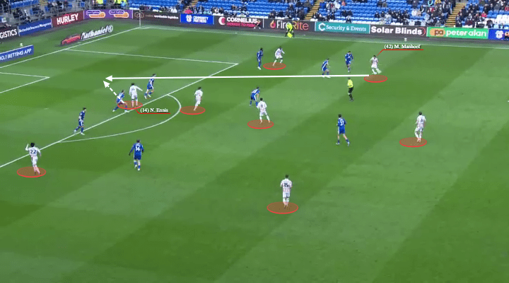
I mean, what a bloody ball that is, right?

Manhoef comes inside and we see Stoke’s fluid setup working perfectly. There are so many options available to Manhoef as he beats his man. Tchamadeu moves wider into the space on the right, Lewis Baker backs off into space between midfielders, Cundle is moving into the half space on the inside right, and Junho is making a run outside his fullback for the raking diagonal.

All of that movement means Manhoef can show a moment of immense quality and vision, see Niall Ennis’ run between two centre halves, and play a perfectly-weighted ball into the space which Ennis couldn’t quite finish.

We see a very different, but still very positive, piece of play here from Burger, Junho and Ennis.

Burger receives the ball in a tight space, and plays it into an area behind the fullback. Junho is aware of this space and makes the run, while Ennis gets into the box. Bae pulls the ball back and Ennis is waiting to pounce, forcing a save from the Cardiff keeper.

Whilst these two may seem like innocuous pieces of play, or further evidence of our poor finishing, I think these chances represent something we’ve been doing very little of recently, which is creating high-value open play chances using our fluidity and quality on the ball.

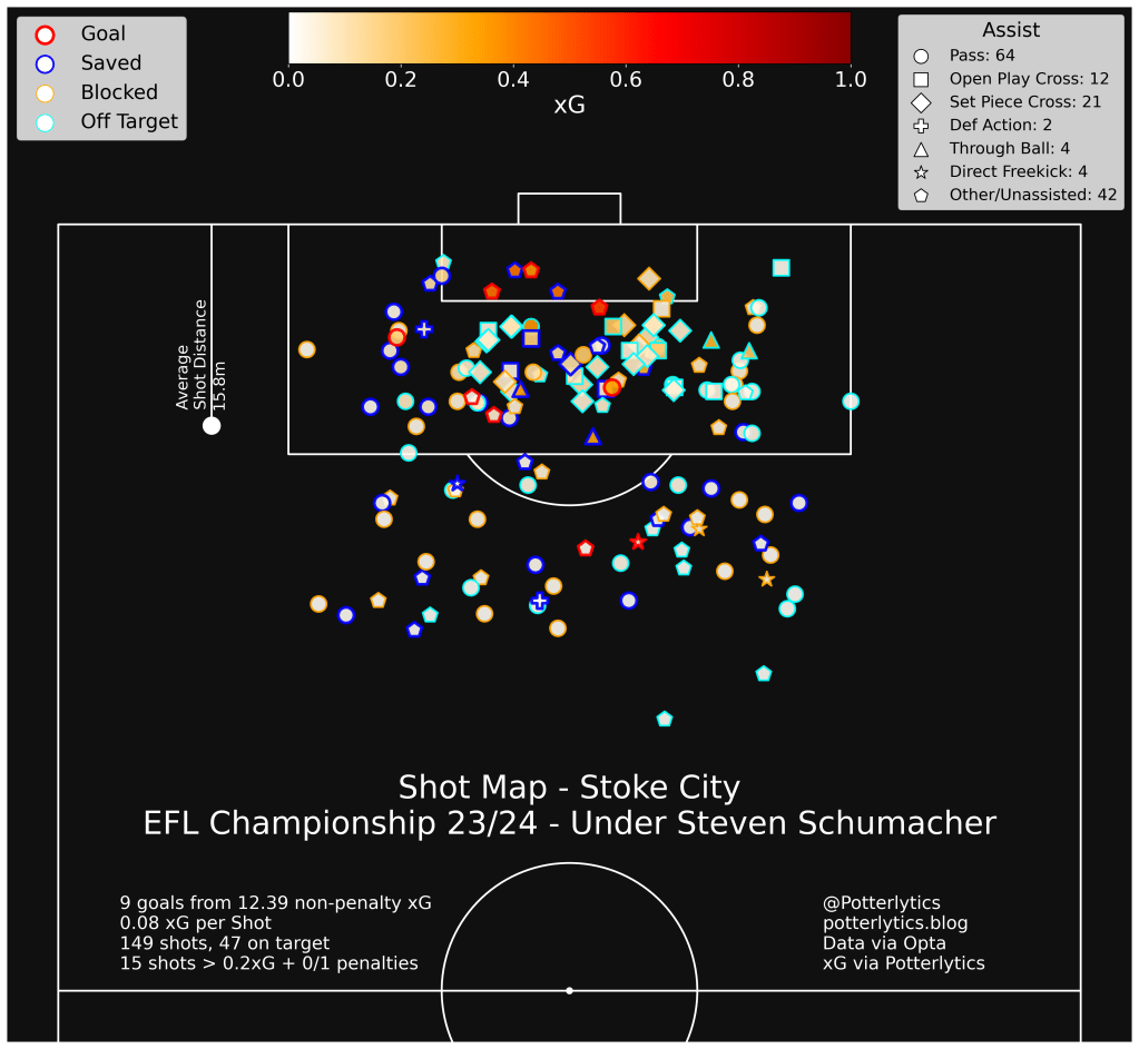
The rankings above give us a little insight into how Stoke have struggled in terms of their creativity and their finishing through the Schumacher reign. I’m in the process of editing a video about this now, so I won’t go into too much depth, but suffice it to say, shot selection and patience around the box is the main vein of thought in my mind.

We can see above that although Stoke take a decent number of shots, have a just above average xG, and about average number of ‘big chances’ (an often-misused stat in my opinion, but useful in this case), they also take a disproportionately high number of speculative chances (again, easily misused, but in this case simply indicating low-value shooting), and a similarly high number of chances are from set piece situations.

While set pieces and lower-value shots aren’t bad, having a high relative number of both types of shot can indicate issues in creating the types of chances that a more dominant side might aim for.

Combined with the low ranking in average xG per shot, we paint a picture of a Stoke side that tends to either create really good chances (such as those above), or hope that potshots and set pieces can save the day. The positive I take from Saturday is that we saw at least two occasions where we created very good chances from quality open-play patterns, something we haven’t seen too often since Birmingham at home.

Of course, the second issue evident in that plot is the finishing. Almost the worst in the division at converting xG into goals, and similarly poor at converting big chances into goals, and it doesn’t seem to be getting much better. The last 4 goals Stoke have scored have been a rebound from a free kick, a back post tap in from a corner, Niall Ennis’ fantastic finish against Blackburn, and an own goal.

There is some evidence this may change, however, as in 6 of the last 7 games, Stoke have amassed a post-shot xG (how likely a shot is to go in given where it’s aimed, how fast it is going, and the trajectory) at least 0.5 above the number of goals they’ve scored. Whilst not hugely comforting and slightly misleading in some cases, it does indicate that there is at least some element of poor luck involved.

Most crucial, though, in my opinion, is the selection of when and where to take shots, and when to look to patiently reset the attack or find another option from a supporting teammate. The two examples above indicate times where we’ve chosen our passes well, and to see a few times we haven’t, look out on potterlytics.com/patreon in the next few days!

But in the meantime, here’s a look at all of our shots under Steven Schumacher.

A Game of Two Halves, Asterisk

Finally, for the third or fourth game in a row, we’ve seen an improvement in how Stoke move the ball in the second half of a game.

Above we have the passing networks for both halves, and we can see that (despite the substitutes being in strange average positions) we’ve got a far better connection between the defence and midfield in that second half.

The play is much more balanced from the defence, rather than consistent play from right to left (and the less said about Thompson’s play in this match the better), and Baker was much more present to receive passes from the central areas than previously.

Now, you may be screaming like a frenzied, rogue Tifo Jon Mackenzie, ‘BUT GEORGE!! THAT’S JUST GAME STATE!!’, and you’re absolutely right. A big part of the improvement in play between the defence and midfield is due to Cardiff sitting deeper, and in fact didn’t lead to an improvement in chance creation or xG.

But there is something to be said for the improvement in confidence in passing in that second half, and although the play around the edge of the box was poor, there were signs that Stoke’s defence and midfield have the quality to play through an opposition press.

To that end, we did see more entries into the final 3rd and the box in that second half.

Now we just have to do something with it…

Thanks to any and all readers, and please feel free to comment and follow on Twitter at @potterlytics or watch out for the new long-form video content at Patreon.com/potterlytics. There’s already a video on Ben Pearson’s role in the side and a video coming soon on our woes in front of goal.

Should you wish to donate to help with the running costs of the site, and the data subscriptions we use, please feel free to visit our donations page here or subscribe to the Patreon linked above. Any and all help is very much appreciated!

George

‘Why Is Your xG Different?’ – An Approximating xG Model for Less-Adequate Data

As a warning, this is more of a brief technical report on the xG values you’ll see in my shot maps this season. It will get quite boring and overly technical. If you’re wanting to read the usual fun articles about Stoke then check back in a day or two for something much more exciting!

Given the vast range of incredibly useful and free data available through sites like FBref.com, Whoscored.com, Infogol and SofaScore among others, you might think there’d be no need to develop your own tools and models for a low-readership blog about as niche a topic as Stoke City FC.

But, as you may well know from my work here, I can’t leave well-enough alone.

Location data in football can be relatively easy to come by in the form of pre-made images and maps. Wyscout is a (relatively) cheap platform that provides these for shots, passes, and other events during games. Whoscored and similar sites provide things like heat maps, pass maps, and other location plots for free, too.

But, finding the raw data can be either a very long or a very expensive process. Access to raw location data via subscriptions, even for one league, can cost several thousand pounds a year.

As a result, you’ll notice that most of my location data last season was through pre-made plots from WyScout.

This season, however, Potterlytics is finally evolving! Having found a method to reliably and cheaply get this data, you can look forward to shot maps, pass maps, heat maps, and so many other maps that I might end up contacting Jay Foreman for a spot on Map Men.

There is, however, one issue. This new, exciting data, doesn’t include with it a measure of the most accepted of advanced metrics, Expected Goals (xG). If you can’t remember how xG works, or just want to remind yourself, check out the previous article on how it works here: xG – A Stoke City Explainer!

There was a possibility that I could cross-match my data with data from sites that do provide xG, such as FBref.com, or the Wyscout platform, but this became impossible to automate. Shots with one provider are not necessarily shots with other providers, for example, and the small differences in shot data on a game-by-game basis made it incredibly time-consuming to ensure each shot was matched with its correct xG counterpart.

It became clear, either I spend the rest of my days matching every shot in one dataset to another dataset by hand, or I come up with my own model.

Luckily, I have experience with predictive modelling in my day job (check out some astronomy we did on predicting stellar ages here! https://ras.ac.uk/news-and-press/news/getting-foot-cosmic-age-ladder-using-machine-learning-estimate-stellar-ages), and so I decided to try and have a go myself.

So, with big apologies to those of you not interested in the minutiae of statistical models who were just looking for a nice Stoke article, here is a brief technical report on how I developed an approximating xG model to suit my data visualisations.

xPect the un-xPected

The goals then was as follows:

  • To generate a predictive model of xG that can closely replicate realistic probabilities with a less- comprehensive dataset.
  • Determine uncertainties on this model and evaluate its prediction capabilities.

Using a training dataset of ~140’000 shots from the EFL Championship (18/19 – 22/23 inclusive) and the Premier League (20/21 – 22/23 inclusive), I aimed to train an artificial neural network (ANN) to predict goal probability from the data I had available.

The dataset provided includes the most obvious, useful information required for such a model, such as x and y coordinates of shots, the body part the shot was taken with, whether it was from open play or a set piece, and calculating the method of assisting the shot (i.e. cross, through ball, counter, cut-back), was simple and has been well explained by others.

Firstly, values for the distance to the centre of goal (r) and the angle to the nearest post (theta) were calculated and replaced ‘x’ and ‘y’ in the training dataset. Additionally, a factor of ‘1/r’ was added.

Finally, the area in which I think helped make the biggest difference to this model, the ‘Big Chance’ metric.

Generally, the phrase ‘Big Chance’ from a data provider can be meaningless. With the data I have used, via Opta, it is defined as ‘A situation where a player should reasonably be expected to score’. This usually involves setting an arbitrary xG value, above which a chance is considered a ‘Big Chance’.

As my model is attempting to approximate more complex xG models like Opta Statsperform’s, the inclusion of ‘Big Chance’ as a feature of my model is a big help. It allows considerations which are not possible with the data I have, such as a goalkeeper out of position, a 1v1, or even the opposite side of the coin in a very close shot surrounded by players, to be taken into account as an average by the model.

For example, two shots, both with the right foot from 18 yards out, both assisted in the same way and functionally exactly the same shot. In one of them, the goalkeeper has been rounded and the player has an open net, in the other, there are 5 defenders and a goalkeeper blocking the path to goal. The first is defined as a big chance, the second isn’t. The inclusion of ‘Big Chance’ therefore means that my model can differentiate these shots, despite not having access to high-level positioning data.

So, with a total of 15 metrics, and a validation set of 10% of the original shots, the ANN model was trained as close to best-fit as possible, 5 times and each iteration saved.

Results

The model predictions (taken from the mean xG prediction of the 5 models) was tested on two datasets from the EFL Cup (21/22 and 22/23).

These produced positive results in the ROC curves, as shown below.

But, that’s a very boring way to check viability, and I need to be more certain that the values in shot maps won’t be ridiculous or incredibly off-the-mark.

So, let’s check via a much more fun method, comparing shot maps to leading providers!

First off, we have one of Stoke’s newest signings, Wesley.

Shotmap of Wesley’s 19/20 season at Aston Villa.

Our model is giving a total non-penalty xG of 7.19, which is worryingly far from FBref’s 5.5 npxG for this season. However, we do see a much closer agreement with Infogol’s npxG for Wesley’s season of 7.18, so I am content with the result in this regard, and content that a variation of 20% in xG is possible even between professional models!

Taking a look at the distribution of estimates across matches, we see that there’s a lot of similarity, bar a big discrepancy on one particular match day.

Comparison of model xG predictions for each game played by Wesley in 19/20. Error bars represent the variation in model prediction between the 5 models.

This corresponds to one particular match vs. Norwich, where Wesley bagged 2 goals, and missed a penalty.

Looking specifically at that match, we see the reasoning behind this discrepancy, with a large increase in xG values in my model for the higher quality chances. His first goal, a right footed finish turned into the goal with the goalkeeper bearing down, was given 0.35xG by FBref, but 0.67 by our model. This is a common theme for high-xG chances, where my model does not take into account whether it is a first time shot, the angle of the incoming pass, and the details of the advancing keeper, who was very close to Wesley.

A similar effect is seen in the rebound to his missed penalty, given 0.43xG by FBref, but 0.55xG by my model, as the keeper is within 1 yard of Wesley, and the ball is off the ground. Both of these cannot be taken account of in my model.

However, even though the mean model estimate is slightly off, there is a significant increase in the uncertainty predicted to reflect this. Both shots have a ~20% uncertainty in their xG value, as the model takes into account the range of xG values possible for these shots.

Across many other players tested, this is a common issue. For example, Tyrese Campbell’s 1st goal against Sunderland, where he slots home into an open net, is given an xG of 0.22 by my model, compared with 0.81xG by the FBref Opta model, which has access to player positions.

Further testing with other data (the same process with all clubs in the 17/18 Premier League season and further testing on Stoke players) shows similar results. The model tends to slightly under-predict some of the lower Opta xG chances, and over predict a few of the highest Opta xG big chances, but overall, the mean ratio of Potterlytics model match xG to Opta match xG is 1.06 ± 0.2.

If I wasn’t using this for a niche Stoke City blog, I’d show a much more in depth analysis of the models, and compare exact xG values to each of the major stats provider models. But I hope there’s at least enough evidence here for you to understand what this model does, what my xG values will be, and where the accuracies/inaccuracies are.

Conclusion

Given the original aim of the model, I’m confident that the xG values predicted provide a reasonable approximation of the more in-depth models, with appropriate uncertainties.

Looking at the principles behind the use of xG, i.e. to measure and present the ‘value’ of a given chance, I find that for my main use of these xG values, shot maps presented on the blog/Twitter/etc., the model provides suitable values that can represent this chance value.

There are more questions on the specific values given for total xG of players, and current testing is determining whether to use these xG values from the model, or to import ‘total’ values from other sources.

Honestly, if you read that and you were expecting a Stoke story, I’m so sorry.

But there we go, now I’ve explained why my xG values may differ from others you see online!

Thanks to any and all readers, and please feel free to comment and follow on Twitter at @potterlytics.

Should you wish to donate to help with the running costs of the site, and the data subscriptions we use, please feel free to visit our donations page here. Any and all help is very much appreciated!

George

Possession is 9/10ths of the Law? – Why Can’t Stoke Win With Lots of Possession?

It’s been said all season, and part of last season too: why do Stoke always lose when they have more possession?

Pete Smith of the Sentinel (@PeteSmith1983) posted just after the Millwall loss, that Stoke ‘have picked up 1 point from the 11 games when they’ve had most of the ball.’

Well, Pete, I’m afraid I have some even more horrifying stats about this to clog up the internet.

Of the top 13 highest possession games Stoke City have had this season, they’ve lost 12 and drawn 1.

Of the 18 games where Stoke have had more possession than their opponents, they’ve won just 2 and drawn 2.

But why is this the case? Are we rubbish at keeping the ball? Are we doing too much of that ‘tippy tappy sh***’? Should we be back to a Mike Bassett 4-4-f*****-2?

Well, let’s take a look into how useful, or not, possession stats can be.

‘Get it forward, boooooooooooo’

First off, let’s look a bit more in depth at those Stoke stats. We might be losing more games, but what does the xG (expected goals) say?

xG can provide a better reflection of a game, by taking into account the quality of chances a team created. For more info see our xG – A Stoke City Explainer! article.

We see that there’s a weak correlation between xG difference and possession, but definitely not enough to draw sweeping conclusions from.

All we can say is that Stoke’s possession doesn’t seem to have much effect on the difference between chances created and conceded, but when they have more possession there is a slight tendency to create more than the opposition.

Now this makes sense, the more of the ball you have, the more chances you’ll create, but we are also seeing signs of what will become a major conclusion from this article.

In the Championship, most matches are not whitewashes one way or another. While there are better and worse sides, many games are decided by a few moments in a closely-fought slog over the 90 minutes.

Because of this, it’s rare to get sides who dominate the ball throughout the whole 90 minutes, and it’s rare to get sides who consistently create through the whole 90 minutes too.

This means that possession can be highly based on Game State.

Game State

Game state refers to, as you’d expect, the current state of the game. This includes information such as who is winning/losing/drawing, by what score, how long is left, and do both teams have 11 men on the field, among other things.

When the game state is negative for a team, i.e. they are losing, they tend to increase their share of possession as the other team becomes less aggressive and plays with lower risk. The opposite is also true of the winning side, as they drop deeper and sit off, they tend to decrease their share of the possession.

With this in mind, one thing we can look at is how Stoke’s possession varies on a game-by-game basis, depending on if they’re winning, losing, or drawing.

For ease of reading this graph, I’ve combined losing and drawing game states into one.

On the x axis we have this season’s games, and on the y axis we have possession figures.

The black line denotes Stoke’s overall possession in that game, across the full 90 minutes.

We see that for all but 2 of the games in which Stoke have had over 50% possession, they’ve had more than half of the possession whilst losing or drawing, and less than half of the possession whilst winning.

When Stoke are winning, they ease off the possession and sit behind the ball, when losing, the opposition tend to do the same, allowing Stoke much more of the ball.

We notice that on the 2 occasions where possession whilst winning is greater than overall possession come against Huddersfield at home – a game where Stoke were by far the dominant side, and Wigan away – a scrappy affair against a poor Wigan team, where neither side could command the ball well or really dominate play.

To look at a slightly easier-to-interpret plot, here is the same x axis of matches, but looking instead at the difference between overall possession and possession in a given game state. Again, drawing and losing have been combined for ease.

Now we can see more easily, the blue bars – when Stoke are winning – are almost all below zero, meaning Stoke have less possession when winning in these games.

The red bars – when the game is even or Stoke are behind – are almost all above zero, meaning Stoke have more possession when not in the lead.

There are, of course, many more factors involved in this. For example, Stoke scored very early on vs Luton at home, meaning the huge possession increase ‘when drawing and losing’ is largely impacted by the opening 3 minutes of the game before Powell scored.

Now it is especially true that Stoke are underperforming their xG by a significant amount, and when in losing situations Stoke have scored 5.51 goals below their expected value.

For winning situations they are overperforming by 0.32xG, in drawing situations they are underperforming by 2.19xG, and the plot below shows these xG performances on a per 90 minute basis. A negative value means scoring less than expected from the chances a team has had, and a positive value means scoring above expected from the chances.

This poor finishing makes a huge difference to the final results, and is certainly a contributing factor to apparent possession – result relationship. Stoke’s results when losing are much worse than their performances in terms of chances created, and as such there are more losses than there necessarily should be.

What we can gain from this is that for sides who aren’t dominant in their leagues or don’t play a specific style of possession based football, such as Manchester City or Swansea, possession does not dictate results.

In the case of Stoke, the relationship appears not to be that more possession causes worse outcomes, but that the game state is dictating the amount of possession.

The poor outcomes then come as a result of Stoke’s awful run of finishing when behind in games, and their inability to win when conceding first during games.

Should we be frustrated that Stoke lose a lot of games when they have more possession? Yes.

Do Stoke need to focus on playing with less possession because it appears to give better results? No.

We once again find ourselves in a situation where correlation does not necessarily mean causation, and in fact the causation is arguably the opposite way round!

Thanks to any and all readers, and please feel free to comment and follow on Twitter at @potterlytics.

Should you wish to donate to help with the running costs of the site, and the data subscriptions we use, please feel free to visit our donations page here. Any and all help is very much appreciated!

George

xG – A Stoke City Explainer!

You see it everywhere in football nowadays, it’s even grown to the point where Sky Sports show it on their post-match stats.

We now appear to be at a point where not only is eXpected Goals (xG) assumed to be common knowledge, it’s also something that its assumed everyone fully understands. But for a lot of people, xG is just a term that suddenly appeared and isn’t necessarily well-understood.

Considering this, I thought a good way to start off the blog here at Potterlytics would be to go through a little xPlainer (I’m sorry) of expected goals, told through the lens of Tyrese Campbell and two beautiful Stoke City goals from recent seasons.

The Basics

So let’s start by looking at the basic concept behind xG.

Football is a very low scoring game, with a high proportion of randomness to the results. It’s much easier for a lower-quality team to eek out a win through a bit of luck in football than in, say, basketball, where games finish with much higher scores.

This means that in football, the final score is generally a poor metric by which to measure the quality of a team’s performance, or to understand the major themes within a match.

As an example, you could say ‘well Stoke had 14 shots and Preston only had 3’ to show that Stoke were the better side, but on further inspection it could be the case that Stoke tried 14 Charlie Adam-esque shots from the halfway line in the last 10 minutes, and Preston had 3 shots from 5 yards out. This is the point where we’d say ‘they had the better chances’.

The best way to consider xG is that it gives you a number that quantifies just how good a chance is. Taking into account historical data, namely thousands of shots from previous seasons, an xG model tells you just how often the average player can be expected to score from a given chance.

There is no such thing as a perfect metric for the quality of a performance, but xG helps at least compare the quality of chances created.

#Ambition’: An xG map of Stoke’s 1-0 win over Arsenal in August 2017, thanks to a Jese goal assisted by Berahino. Larger squares indicate a higher xG chance, and a higher probability of scoring. The pink square is the goal. Credit: Michael Caley, @MC_of_A

‘How can you score 0.47 goals? What a load of ****’

xG values are usually quoted in terms of the probability of a goal being scored from zero to one. 0 xG would indicate that it’s impossible to score the chance, and 1 xG would indicate that it’s impossible to miss.

If a chance has an xG of 0.47 from a given model, that means that in that model’s historical data, a goal was scored from this type of chance 47% of the time, i.e. for every 100 of these chances, there were 47 goals.

Interestingly, it’s usually the case that xG is much lower than you’d expect, for lots of chances. xG can never be 1, as even a half-yard tap in is missed very occasionally. Let’s give a few examples and then take a look at a very fun Stoke City goal.

‘How’s he missed that?’

Take, for example, a penalty. Before you read on, think carefully and have a guess at how often you’d expect an average penalty taker to score. 90% of the time? Surprisingly it’s not that high! A penalty is in fact (using Wyscout models) 0.76xG, meaning only 76% of penalties are scored.

Extra points if you assumed lower than 0.76 because of Stoke’s record.

We can take a look below at the xG model that takes into account only the location of the shot, to see what kind of values we can expect:

An xG map showing the probability of scoring from various locations on the pitch. This model takes into account only the location of the chance. Credit: https://www.datofutbol.cl/xg-model/

Now better models will take into account much more than just the location of the shot. Let’s use Tyrese Campbell’s goal vs Preston, from 22/23, as an example:

Unleash Tyrese

In the 2-0 away win at Preston North End, Tyrese Campbell scored the second goal with a placed shot from just inside the box. On our map above, the location is marked with an ‘x’. We see that this gives us an xG value of around 0.15, meaning a shot from this location is scored about 15% of the time according to the model.

If we look at Infogol’s model value, we see that they assign a probability of 0.12 xG to this chance.

Wyscout on the other hand, assign it a value of 0.07 xG, and FBref.com go even lower to 0.03 xG.

Where’s that difference coming from?

Well, aside from models using different datasets, which will include slightly different shots, and models themselves learning from the data differently, the major difference here is what information is included when we define a type of shot.

‘This man’s magic’ – Campbell has very little space and a lot to do to score this chance. Image from Wyscout

Looking at our first model from the map above, we see that in Campbell’s shot, he’s about 14 yards out, to the right of the goal, and that’s all the information our model has! From this, we can say only that a shot from this area results in a goal about 15% of the time.

Now, better and more rounded models can add in more info. For example, the 3 other models take into account information such as angle to the goal, how the shot was assisted (e.g. cross or through ball), and the body part with which it was taken (strong/weak foot or header).

In addition to this, many of the models will include even more infortmation. Opta data (used by FBref.com, and many professional football teams/leagues) takes into account the positioning of defenders, the status of the goalkeeper (is he set or in motion?), and the height at which the shot is struck.

We can see very simply how this affects the xG value. Our FBref value of 0.03 xG was much lower than the others, due to the pressure Campbell is under. Two defenders directly in front of him, and a set goalkeeper waiting for the shot.

Left: A 0.15xG chance, Right: A 0.03xG chance

The Return of the Messiah

Now we can further see this difference by comparing the Preston goal with Campbell’s first goal after his injury layoff, vs Peterborough in November 2021. He receives the ball from a pass by a teammate, and takes a shot from a similar position.

Similar position, same outcome. Campbell finishes well on his weaker foot past the keeper.
xG = 0.25. Image: Wyscout

However, this time, there are two obvious differences.

Firstly, Campbell takes the shot with his weak foot, slightly decreasing the chance of scoring. More importantly, however, he has a clear view to goal, with only some pressure to his left, from a defender he has just dribbled past.

The combination of these extra differences for two chances in a similar position increases the FBref xG from 0.03 xG to 0.25 xG.

Hopefully this provides a nice intro and explainer for those who are interested in Stoke, and didn’t previously understand what xG was used for and how it was developed. Any and all comments are appreciated!

This is the first of many posts on this blog, and the aim is to contribute between once a fortnight and once a week some form of longer piece here. Alongside that, we have regular brief threads on Twitter at @potterlytics.

Should you wish to donate to help with the running costs of the site, and the data subscriptions we use, please feel free to visit our donations page here. Any and all help is very much appreciated!

George